Cascade Template Versions
We rolled out our latest version of branded template in early 2020. If your site was built or migrated after 2020, you are likely using Version 3 of our templates. If it was built/migrated before 2020, you are using version 2.0 of our templates.
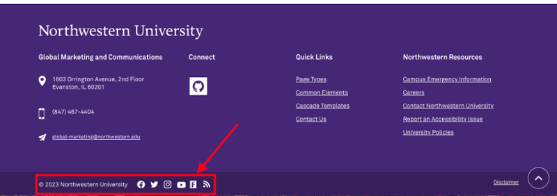
A quick way to find out what version you are on is to check your site's footer. If your site's footer has an additional university social media that runs horizontally, it is in Version 3. 
Important Changes for Content Editors in V3
- Standard left nav page in V2 has been renamed to Content Page in V3.
- Changed header order for improved SEO: H1 is now page title instead of site name. This means that in the content area, the first heading will be Heading 2 instead of Heading 3.
- Separate asset type for images in the "Add Content" dropdown.
- Added captioned image styles (external link) on content pages. See instructions to add caption to your images.
Additional changes and enhancements in V3
Navigation Improvements
- We created two different menu options (external link):
- The first option is our basic standard drop-down (expands from 1 to 3 columns depending on the number of pages in the folder). The second option is used for deeper, more complex sites.
- This second option includes short section descriptions and quick links for easier access to popular content.
- Site users were often skipping the top menu items that serve as section landing pages. Section landing pages are extremely important tools that provide overviews of the content in the section and improve user's ability to navigate the site, especially on mobile. To encourage users to visit the section landing page we have added a "section overview" link to all top navigation dropdowns.
Mobile Menu Improvements
- We made the entire mobile menu line/bar clickable. To improve the functionality of the mobile menus, we created a larger touch target. If there are subpages to the section the entire bar is an expand/collapse. This prevents the user from having to click a small plus icon to open the menu. If there are no sub-pages in the section, the menu line/bar will take you directly to the selected page.
- We simplified the mobile menus. Mobile menus were getting long, causing confusion and often led to decision paralysis. To overcome this confusion and shorten the time spent navigating the site we 1.) reduced the mobile menu display to three levels deep and 2.) no longer open the mobile menu to the current section of the site (breadcrumbs will still show site section). Very few sites are deeper than three levels, those that are should double check that they are properly utilizing the section landing pages by linking to all subpages.
- Responsive tabs will turn into an accordion on smaller screens.
- Photo Feature gradients are automatically applied for improved color contrast.
- Expand/Collapse has an optional "expand all" option.
- Stats module handles multiple stats. This change applies to both the standard and full-width modules pages.
- Many page types can now be toggled between left-navigation and no left-navigation by editors through a radio button. The no left navigation option should only be used if there aren't other pages in the same folder.
- Optional news and event landing page pagination controlled via radio button.
- Combined small, medium, and large people pages controlled via radio button.
Note – Please republish the entire site whenever you add, remove or rename an asset that's part of your top navigation.
News/Events/Twitter Modules
- We created multiple variations and layouts for the news/events/Twitter modules. The content editors now have the flexibility to rearrange the number of columns and options to accommodate their changing content needs. Please contact OGMC if you wish to use any of the new modules and need help.
Footer changes
- Separated department info and university info in the footer. Grouped similar items and created labeled sections for better findability.
- You can leave out a column if there's no content
- Added the ability to show university social media and department social media (whereas previously you could only add one), a site feedback option and call to action spot that can be used for newsletter signup, and moved the disclaimer to a less prominent location.
Note – You can edit footer content under _common/Footer folder.