PMS: 360
CMYK: 68,00,100,00
RGB: 88,185,71
HEX: #58B947
Although our color system is monochromatic, in certain instances, another color may need to be used.
For those circumstances, we have developed this set of secondary colors. These colors should be used rarely and sparingly. Under no circumstances should any of them become the predominant color for a school, center, institute or department.

CMYK: 68,00,100,00
RGB: 88,185,71
HEX: #58B947

CMYK: 48, 00, 22, 00
RGB: 127, 206, 205
HEX: #7FCECD

CMYK: 68, 34, 00, 00
RGB: 80, 145, 205
HEX: #5091CD

CMYK: 10, 00, 89, 00
RGB: 237, 233, 59
HEX: #EDE93B

CMYK: 00, 23, 95, 00
RGB: 255, 197, 32
HEX: #FFC520

CMYK: 01, 82, 80, 00
RGB: 239, 085, 063
HEX: #EF553F

CMYK: 87, 24, 83, 09
RGB: 000, 134, 086
HEX: #008656

CMYK: 86, 39, 23, 01
RGB: 000, 127, 164
HEX: #007FA4

CMYK: 100, 85, 05, 36
RGB: 013, 045, 108
HEX: #0D2D6C

CMYK: 18, 14, 100, 0
RGB: 217, 200, 038
HEX: #D9C826

CMYK: 00, 48, 97, 21
RGB: 202, 124, 027
HEX: #CA7C1B

CMYK: 02, 77, 100, 09
RGB: 216, 088, 032
HEX: #D85820
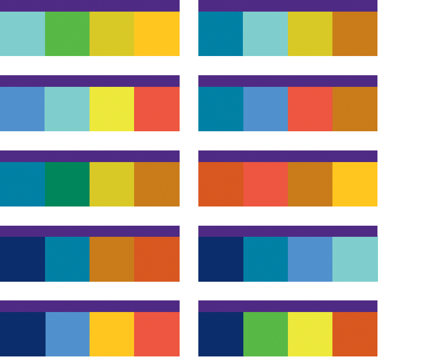
The following examples break down the secondary color palette to show how color combinations can be used successfully. Each is different but still should be used in extremely limited instances, in the ways described in this document. The primary palette should always be predominant.
Note: A strip of Northwestern Purple is included in each of these palettes. It is there only as reference to see how it works with the secondary colors. It is not indicative of the proper ratio of use between the colors.

The best uses for colors of the secondary palette are for items that require differentiation, for example, within charts and graphs, or for updates or callout buttons in digital applications.