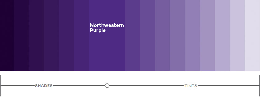
Our visual branding relies almost exclusively on a proprietary Northwestern Purple (Purple 100) and its tints and shades. By using a range of tones, we add flexibility without sacrificing the recognition and equity of our heritage color. The range of tones runs from Northwestern Purple 160 (darkest) to Northwestern Purple 10 (lightest). Anything darker or lighter loses its connection to Northwestern Purple.
The new Northwestern Purple is a custom ink color and can no longer be referenced by a Pantone number. Designers and vendors must refer to approved color swatches (coated and uncoated paper, fabric, and plastic chips) to ensure color accuracy. To obtain a swatch packet, please contact Anne Egger

Our Palette
The strength of our palette is its consistency. Adhering to these color guidelines will result in clean, comprehensive communications that are instantly recognizable as Northwestern's.
Although our new color palette is based on Northwestern Purple, the predominant color in most layouts should be white. By incorporating plenty of white space, we ensure that our communications feel clean and modern. This guideline also helps us to be mindful of content length. Rather than viewing white space as a blank area, see it as a pause. Don't rush to fill up a page—white space helps to focus attention on what is there.
NOTE: Rich black and its tints should be used in place of process black in all instances except body text. When setting text at sizes smaller than 12 points, process black and its tints should be used.
Color Codes
Color code equivalents for Northwestern Purple and related tints are provided below. Color code choice depends on the intended output (print or digital). Using correct codes will ensure accurate color reproduction.
Output: Print
Please note that CMYK tint values are different for coated and uncoated paper stocks; use the appropriate codes for correct reproduction.
CMYK on coated paper: Use these color codes when printing on coated paper, which has a smooth, hard surface that minimizes ink absorption. Coated color values will reproduce poorly if printed on uncoated stock.
CMYK on uncoated paper: Use these color codes when printing on uncoated paper, which is not as smooth as coated paper and absorbs more ink.
Output: Digital
RGB: RGB color codes should be used when creating digital materials (online graphics, social media icons, presentations to be viewed on a monitor, etc.).
Hex codes: Hex codes should be used when creating websites. However, because hex code equivalents do not exist for all the tint values.
Usage
Plastic or fabric materials
Give your vendor the appropriate color swatch to ensure that the end product will match Northwestern Purple as closely as possible.
To obtain a swatch packet, please contact Anne Egger.
View the secondary color palette or download color files.
Secondary brights/darks palette
Download all color files
White Space
Although we have a new color palette based on Northwestern Purple, the predominant color in most layouts should be white. With plenty of white space, our communications feel clean and modern. Plus, this guideline helps us to be mindful of our content's length. Rather than viewing white space as a blank area, see it as a pause. Don't rush to fill white space. It can focus attention on what is there.
