Canvas Skills for Course Instructors
Seven Core Skills
Creating accessible digital content that can be used by all students is the responsibility of everyone who creates Canvas course content. Accessible digital content has benefits for all students, and especially for students with disabilities.
Creating and editing in Canvas with a digital accessibility focus may feel unfamiliar at first, but this approach is an extension of inclusive and equitable teaching practices that you likely already have in practice in your class. Focusing on seven core skills, will enable you to create content that helps cultivate a more accessible, inclusive, and equitable digital environment at Northwestern.
Learning these skills is quick and applying them to your Canvas pages addresses several of the most common accessibility issues that people with disabilities encounter. If you haven't previously considered accessibility when designing courses, start small, and build from there.
These are the areas where you can apply quick fixes and have a huge impact on the accessibility of your Canvas content:
Accessible Content Checker - Pope Tech
Whether you are building a Canvas course from scratch or editing an existing course, Northwestern offers an automated accessibility checker, the Pope Tech Accessibility Guide, to help identify and remediate accessibility issues with your content. The Pope Tech Accessibility Guide is a robust automated checker that has fewer limitations than most automated checkers and makes it easy to address high-impact accessibility issues in your Canvas content.
Pope Tech Accessibility Guide
The Pope Tech Accessibility Guide will identify and fix accessibility issues when in edit mode in the text edit field (Rich Content Editor) of a Canvas course page. The Pope Tech Accessibility Guide can be used in the following areas of a Canvas course site:
- Pages
- Syllabus
- Announcements
- Discussions (instructor-entered prompt and instructions field)
- Classic Quizzes (instructions field)
- Assignments (instructions field)
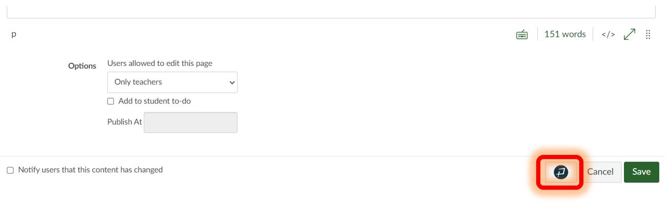
To activate the Accessibility Guide, click on the Pope Tech button located on the bottom right-hand corner of the Rich Content Editor next to the Cancel and Save buttons.
When activated, the Accessibility Guide appears on the right side of your screen. It uses the Seven Core Skills to categorize errors and alerts that need to be addressed on each page. As you move through the guide, it highlights the error or alert in context on the active page and provides support to fix the issue. To learn more about an error or alert, what it means, why it is important, and how to fix it, click on the question mark next to each issue. Once you address each error and alert on a page via the Accessibility Guide, you can be confident the page is accessible.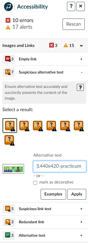
Pope Tech Accessibility Dashboard
In addition to the Pope Tech Accessibility Guide that is available at the page level, a course-level Accessibility Dashboard is also available to review a full report of the errors and alerts across your entire Canvas site. The Accessibility Dashboard can help you to prioritize which pages to address and in what order.
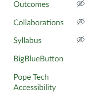
To view the Accessibility Dashboard, you will need to add the Pope Tech Accessibility option to your Canvas menu. Only instructors will be able to see this option—not students. The Pope Tech Accessibility Dashboard can be enabled by:
- Clicking on Settings in the course navigation
- In the Navigation tab, locate Pope Tech Accessibility
- Click the three-dot icon on its line, then select Enable
- Scroll to the bottom of the page, and click Save
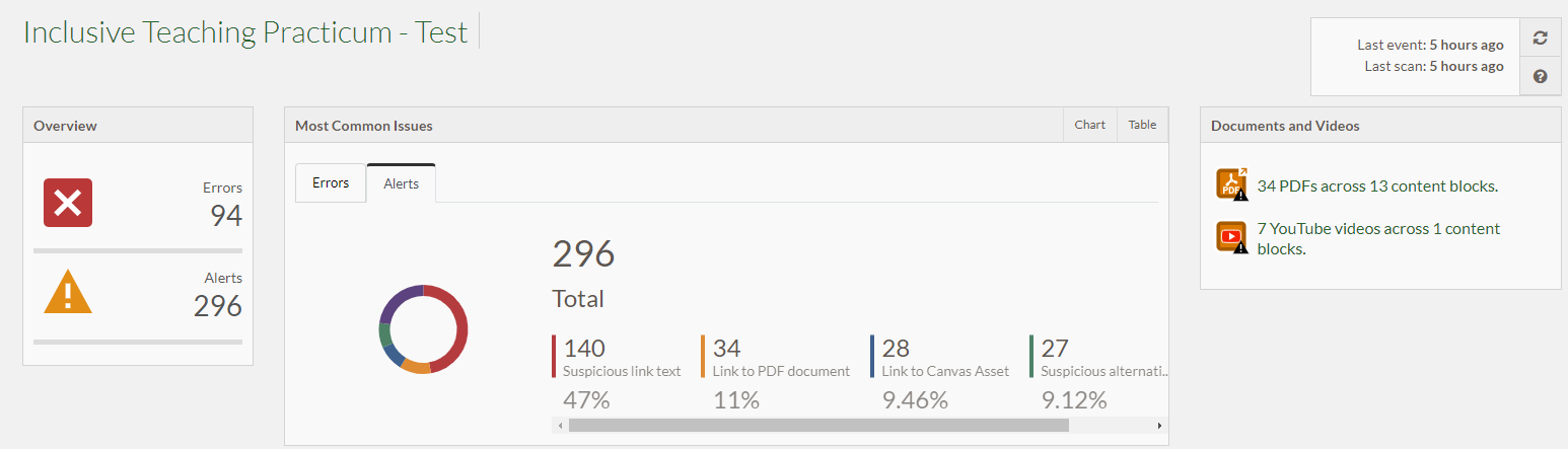
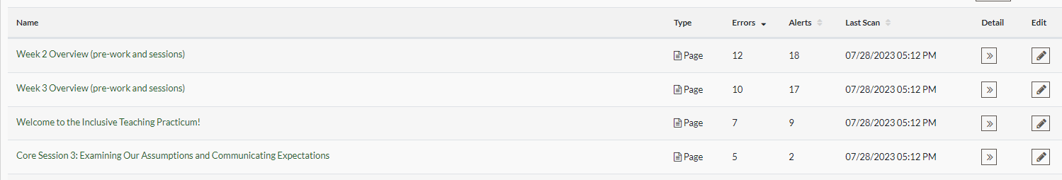
 Here is an example of the data available in the Accessibility Dashboard, showing the number and types of alerts in the course:
When you click on the button in the detail column associated with a page, you will get a full breakdown of the errors and alerts on that page. When you click on the button in the edit column associated with a page, it will open that page in a new tab with the Accessibility Guide in edit mode.
Note: Both the Pope Tech Accessibility Guide and Dashboard are only scanning content authored in the Canvas platform for errors. They will identify documents that have been uploaded and prompt you to manually check them, but they will not identify accessibility errors or alerts on documents uploaded to the course site (e.g., Word docs, PDFs, PowerPoint, or Keynote presentations, etc.).
For more information, see the Pope Tech help guide on how to access and use the Pope Tech Accessibility Dashboard and Accessibility Checker.